
Redesigning the MongoDB University sign-up experience to motivate new users to create an account.
Problem During my internship with MongoDB, my product manager and I saw an opportunity to improve the existing MongoDB University sign-up page with the goal of increasing user conversion rates.
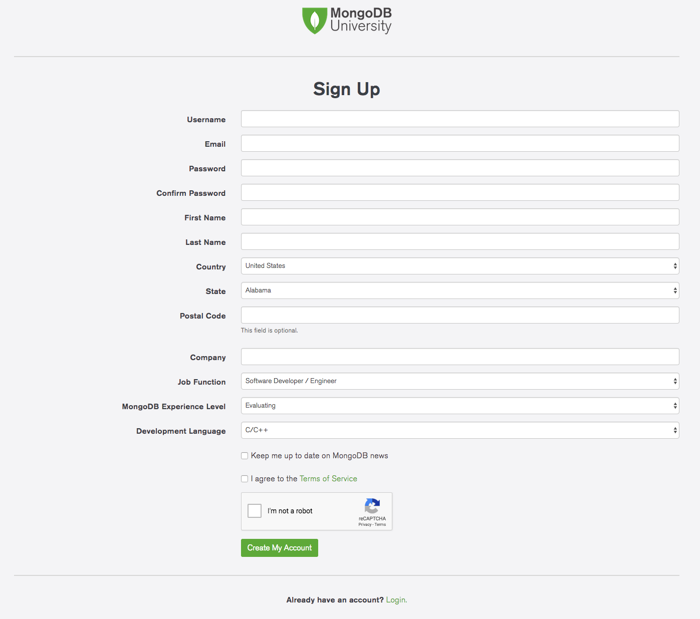
Based on anecdotal assumptions, we identified the lengthy sign-up form, which consisted of 16 different fields and inputs, as a usability issue that overwhelmed users and deterred some of them from signing up for a MongoDB University account.
I took the initiative to lead a redesign of the sign-up page by creating an appealing experience that would motivate more new users to join MongoDB University.
Logistics
- Project Type: Internship
- Team: 1 Designer, 1 Product Manager, 2 Developers
- My Roles: Research, Interaction Design, User Testing
- Time Frame: 3 Weeks
- Confirm that there are usability problems with the existing sign-up experience
- Learn about the usability problems and users' pain points
- Learn about user's expectations of a positive sign-up experience
- Research other sign-up pages from popular web apps
- Investigate the common qualities or characteristics of effective sign-up pages
To achieve these learning goals, several research methods were conducted:
- User interviews
- Competitive analysis
- Literature review
For the user interviews, 6 different users who had recently signed up for MongoDB University in the past week were interviewed. The interview questions focused on learning about users' experiences with signing up for MongoDB University as well as their expectations of a positive sign-up experience.
Regarding competitive analysis, sign-up pages from popular user-facing products were studied using heuristic evaluations. Some of the products included Yelp, Dropbox, Facebook, Airbnb, Github, and Google.
For literature review, several articles by UX bloggers who also designed sign-up pages were reviewed. Many of these designers wrote about best practices for sign-up pages based on their own experiences.
After conducting these research methods, the main research insights that were gathered were:
- The existing MongoDB sign-up page had several usability problems: overwhelming number of input fields, inapplicable fields, such as "programming language" for non-coders, irrelevant personal fields, such as "home address", and accidentally navigating to sign-up instead of sign-in, vice versa
- The primary stakeholder groups consisted of software developers and database administrators
- Sign-up interfaces should be: simple and short, relevant to the product, playful, memorable, persuasive in terms of showing value proposition, and responsive to user input
- Sign-up interfaces should not be: long, confusing, intrusive, or exclusive with regards to catering only towards narrow user groups
- Short, concise: include the minimal number of fields necessary and hide/simplify information if possible to increase approachability
- Interactive, responsive: show immediate feedback for validated fields and error fields, caps lock, etc., and fedback messages next to corresponding fields
- Informative: show password requirement and field labels
- Persuasive: sell a value proposition and convince users to join base on XYZ reasons
- Playful, emotional: use colors or imagery to evoke a playful mood
Next, several different UI ideas of the sign-up and log-in pages were brainstormed. Each of these UI designs addressed the design criteria to varying degrees:
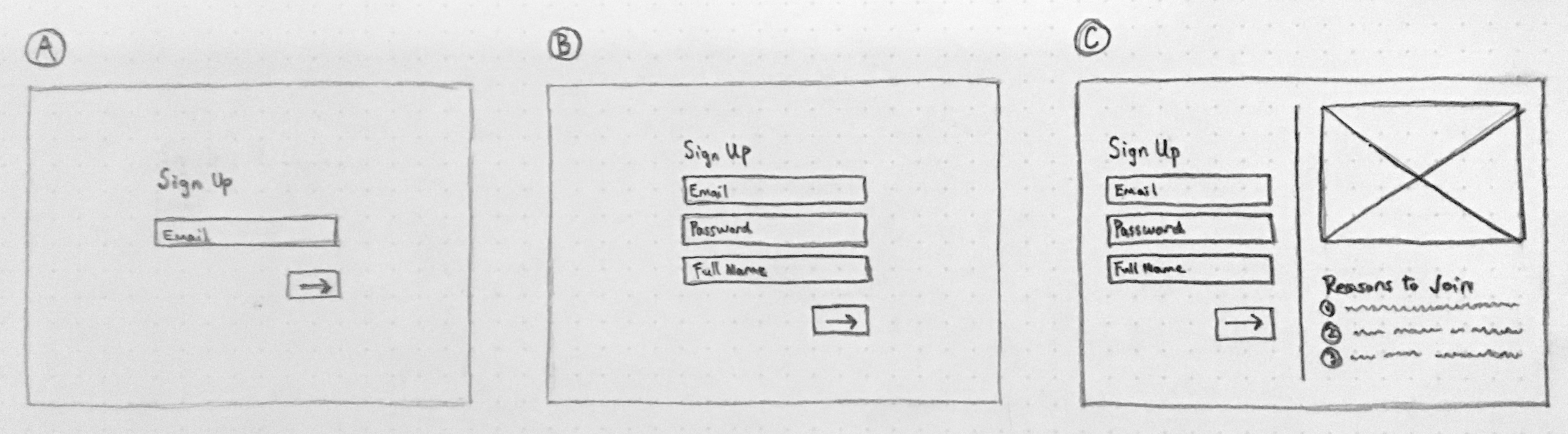
- Design A explores the idea of a ultra minimalist sign-up page in which users would only need to enter their email, which would significantly lower the barrier of entry. Users would then be asked to create the rest of their account through email.
- Design B features a common, streamlined sign-up page design featuring only the necessary fields. This design is aimed towards users who want frictionless sign-up page that gets out of their way.
- Design C focuses on catching the user's eye by also showcasing a playful branded illustration and offering persuasive reasons to join.
While Design A's single field sign-up form was straightfoward in theory, my product manager and I decided to move past the idea because we thought the unconventional single field form may be confusing and the experience of switching back-and-forth between email would be inconvenient.
Between Design B and C, we moved forward with Design C because we wanted our sign-up page to feel unique and persuasive so that users would feel attracted to MongoDB University's value proposition.
In addition, my product manager and I were able to compromise to reduce the number of required sign-up inputs from 16 to 8. This decision would streamline the user experience while still allowing for collection of user data for SalesForce on the business end.
Next, I created user task flows to understand how the sign-up page would function at a high level. This process helped me to identify 3 main tasks: registration, sign-in, and switching back-and-forth.
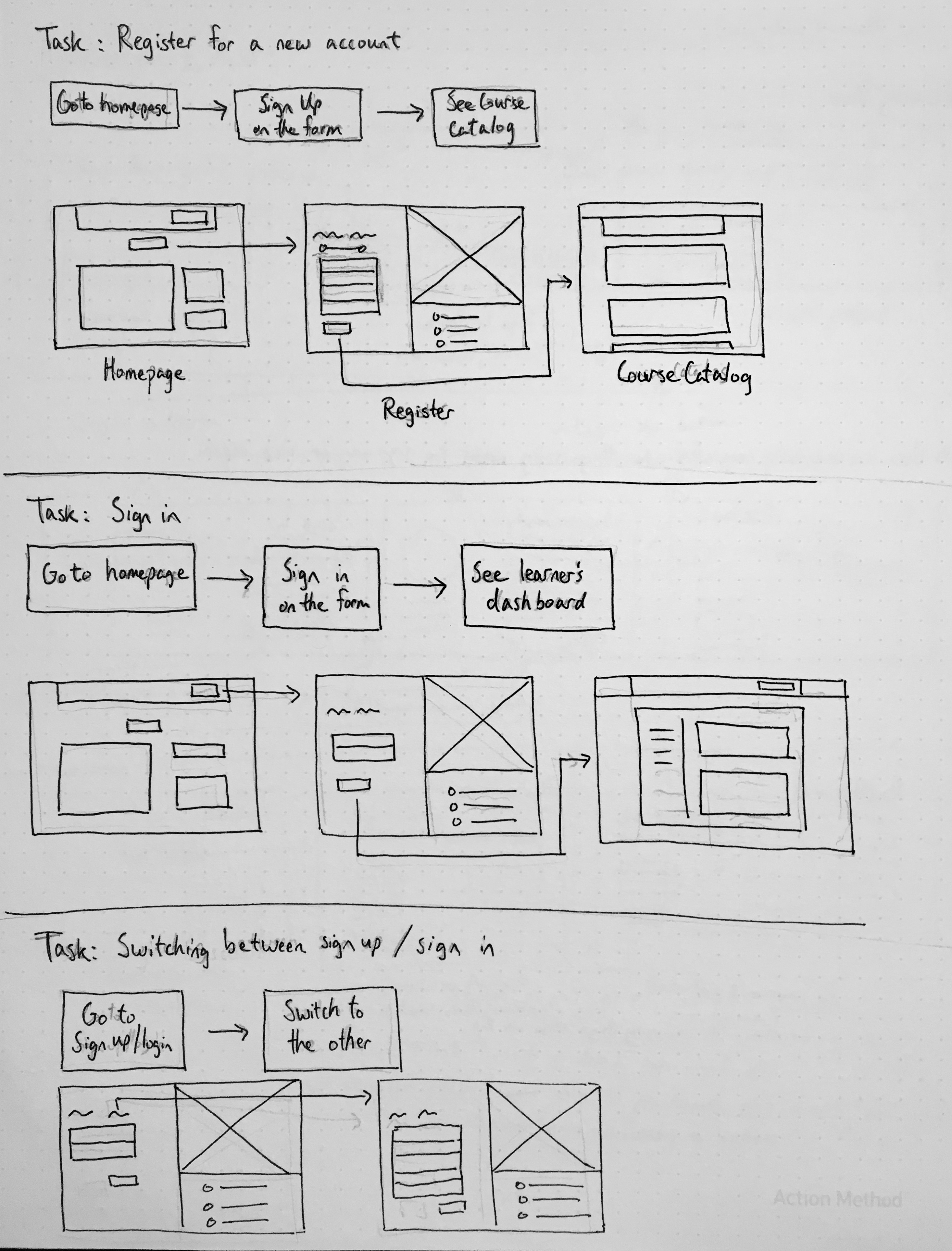
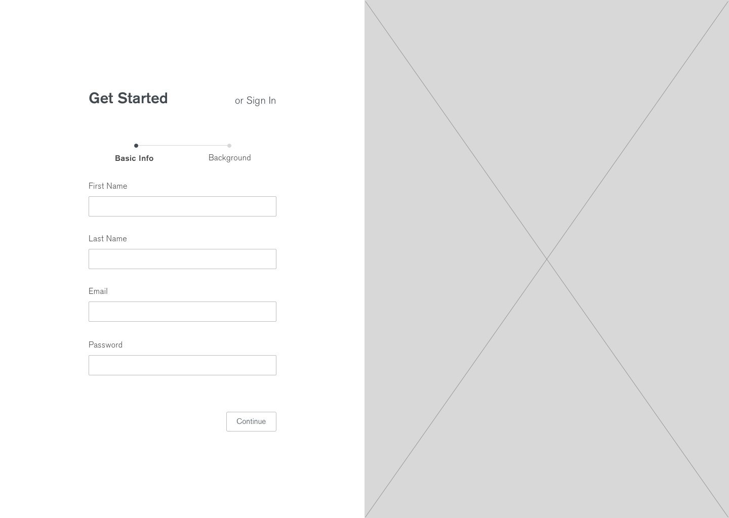
To support the last task, which addresses the use case of users accidentally navigating to sign-up or sign-in, I included an interactive toggle label for switching between the two. I also split the sign-up fields into two sections to make the sign-up flow feel more digestible in smaller chunks.
These wireframes were then used to design a medium-fidelity Invision prototype of the new MongoDB University sign-up page.
User Testing After a medium-fidelity prototype was created, user testing was conducted to learn about how well, if at all, users would be able to perform the primary use case tasks using the new sign-up interface.
The user tests were conducted at medium-fidelity rather than high-fidelity so that feedback could be gathered earlier and that there could be a focus on designing core functionalities of the interface before addressing visual design polish.
The main learning goals of the user testing were to:
- Learn about users' first impressions
- Observe users complete the benchmark tasks: create a new account, sign in with an existing account, and recover password
- Learn about users' thoughts and feelings as they move through each step of the task
- Learn about users' pain points, confusions, or errors
- Learn about what the user would like to change, add, or remove
Each user testing session consisted of a task walkthrough and follow-up interview to learn more about the users' decisions. A total of 6 user tests were conducted. However, due to time constraints, only software developers were recruited for these sessions. A future improvement would be to also recruit database administrators in order to more accurately represent the diverse stakeholder groups.
After conducting qualitative coding and quantitative analysis on the user testing results, the main testing insights revealed that:
- Many users' first impressions of the sign-up page were that it was short, simple, and straightforward
- All the users were able to complete each task with little to no difficulty
- Users had a hard time visualizing the illustration and wished to see a sample illustration. From this, I learned that it's okay to include images if they're an essential part of the prototype.
- Users liked the UI elements that showed responsive feedback, such as check marks for fields
- Users recommended some UI tweaks, such as returning to sign-in after password recovery, greying out continue buttons until fields have been completed, and auto-filling the email field in password recovery based on past sign-in attempts
- Condensed the sign-up to a single page format from a double page format to allow users to see all the fields at once; my PM showed me research that showed users prefer the transparency of single pages - performing A/B testing to learn which users prefer would've been useful in hindsight
- Improved flow for password recovery by updating a button to return to sign-in
- Increased UI responsiveness by showing the "continue" button as accessible only after the form had been completed
- Increased convenience for password recovery by auto-completing email input
Based on positive feedback and the project timeline, I moved the design foward to high-fidelity using the MongoDB design system.
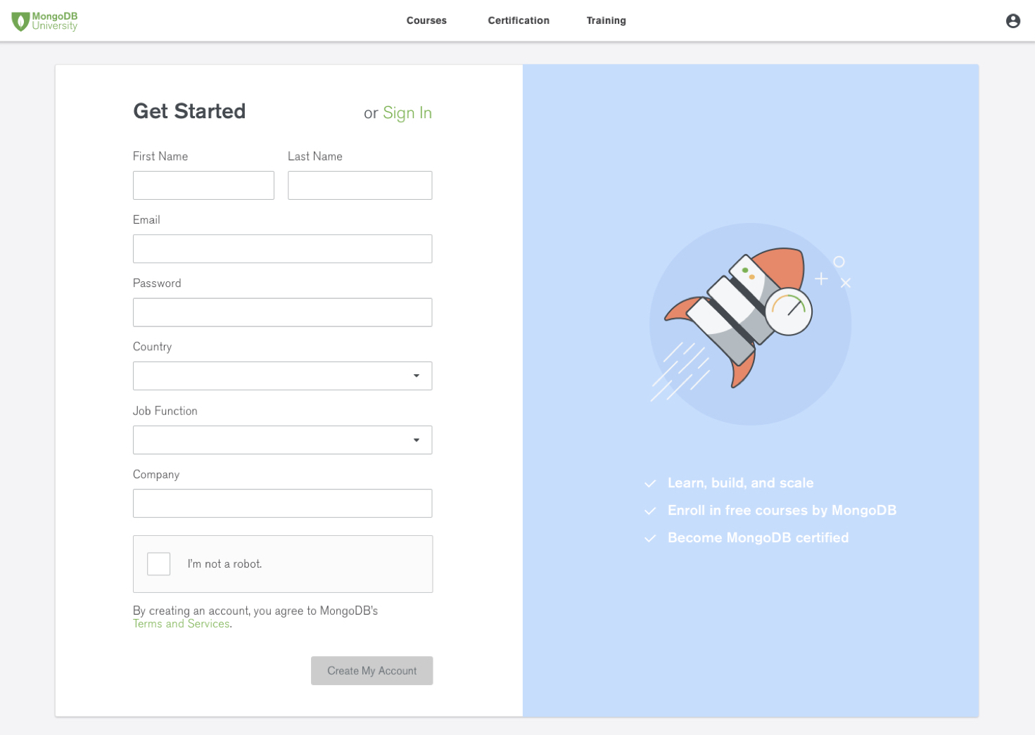
The colorful illustration conveys a sense of playfulness that promotes the positive mood of the MongoDB University brand. Moreover, the three selling points represent a value propositions for new users.
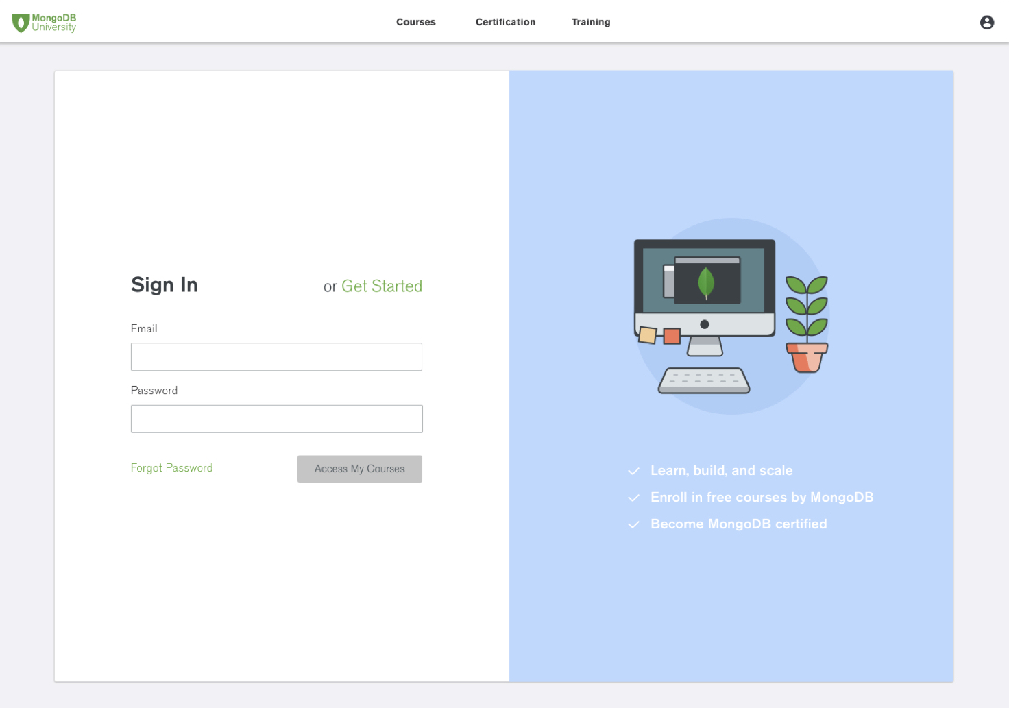
The design also features an emphasized, interactive label titled "Get Started" or "Sign In" that allows users to toggle back and forth between the sign-in and getting started pages. This feature addresses the scenario in which users accidentally navigated to one page instead of the other.
After the high-fidelity mockups were created and approved, an Invision prototype was delivered to the MongoDB University platform development team to implement the front-end redesign. Impact and Ending Thoughts Meanwhile, it was two weeks before MongoDB World 2018, a global developer conference. We noticed that we were very close to surpassing 1,000,000 registered users and made a goal to surpass it before the event.
Because my redesign hadn't been implemented yet, we borrowed elements from my design to improve the existing sign-up design, such as reducing the number of fields from 16 to 8. Two weeks later, the night before World, we were able to hit our milestone of 1,000,000 registered users!
Fast foward to December 2018, the redesigned sign-up page was shipped to the home page. I noticed some design discrepancies between the mock-ups and the live version, but I'm content overall that my work saw the light of day after my internship.
This was the first project I completed at MongoDB, and I felt very proud of my team's execution. We were able to identify users' problems and address their needs by following a data-driven design process. Moving foward, I'm very curious to see if the new sign-up metrics are validating the design's effectiveness. Only time will tell!


Made with  by Jesse
by Jesse


